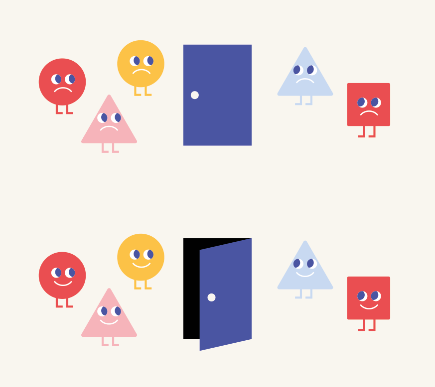
I created a way to use the shapes together with the font (it’s now the Google font Poppins). The text can appear and disappear in an animated gif revealing the name as if the school is a light that turns on. bring school to life in a way.
It’s also an alternate way to use only the name without the characters. On the top of the website or on places where one does want to be a little bit more serious and still look like a logo and not just text.
STUDIO MARIA WALNUT
This means I would say we should use the characters and arrows as a separate element and not necessarily a logo.
This way we can control a bit more the level of playfulness we want to express, depending on the message and tone we want to communicate. So in some places it can be a little bit more serious than others.
These would work really well on social media and even as little looping animations!
It’s a very subtle change but I did a lot of thinking about how the different elements should be used together. Adding an actual typographical logo can hopefully help make it stronger and less playful when necessary.
Both elements still work together side as one element but there will not be a great need for that option, at least not on the element but I think the shapes and road definitely can function more as illustrations and a complement to the logo.
Together I find that it becomes a little bit too much so I wonder if it would also work to just use the simple text version when we really want to have both elements (let’s imagine we want to make a mug or a sticker...)
There are lots of possible combinations depending on the specific use. I hope this helps make it clear!
Nieuws
Houd de scholen helemaal open
Laat pubers snel weer naar school gaan, dat hebben ze nodig
Het is niet de vraag óf, maar hóe de scholen open kunnen